
Format: Scene Title Cards
Client: REP Stage
Skills & Tech: Print Design, Pre-Press Production, Adobe Illustrator, Adobe InDesign
Typeface: Adobe Caslon Pro
Photography: Stan Barouh
URLs: Baltimore Sun Review, DC Theater Scene Review
Skills & Tech: Print Design, Pre-Press Production, Adobe Illustrator, Adobe InDesign
Typeface: Adobe Caslon Pro
Photography: Stan Barouh
URLs: Baltimore Sun Review, DC Theater Scene Review
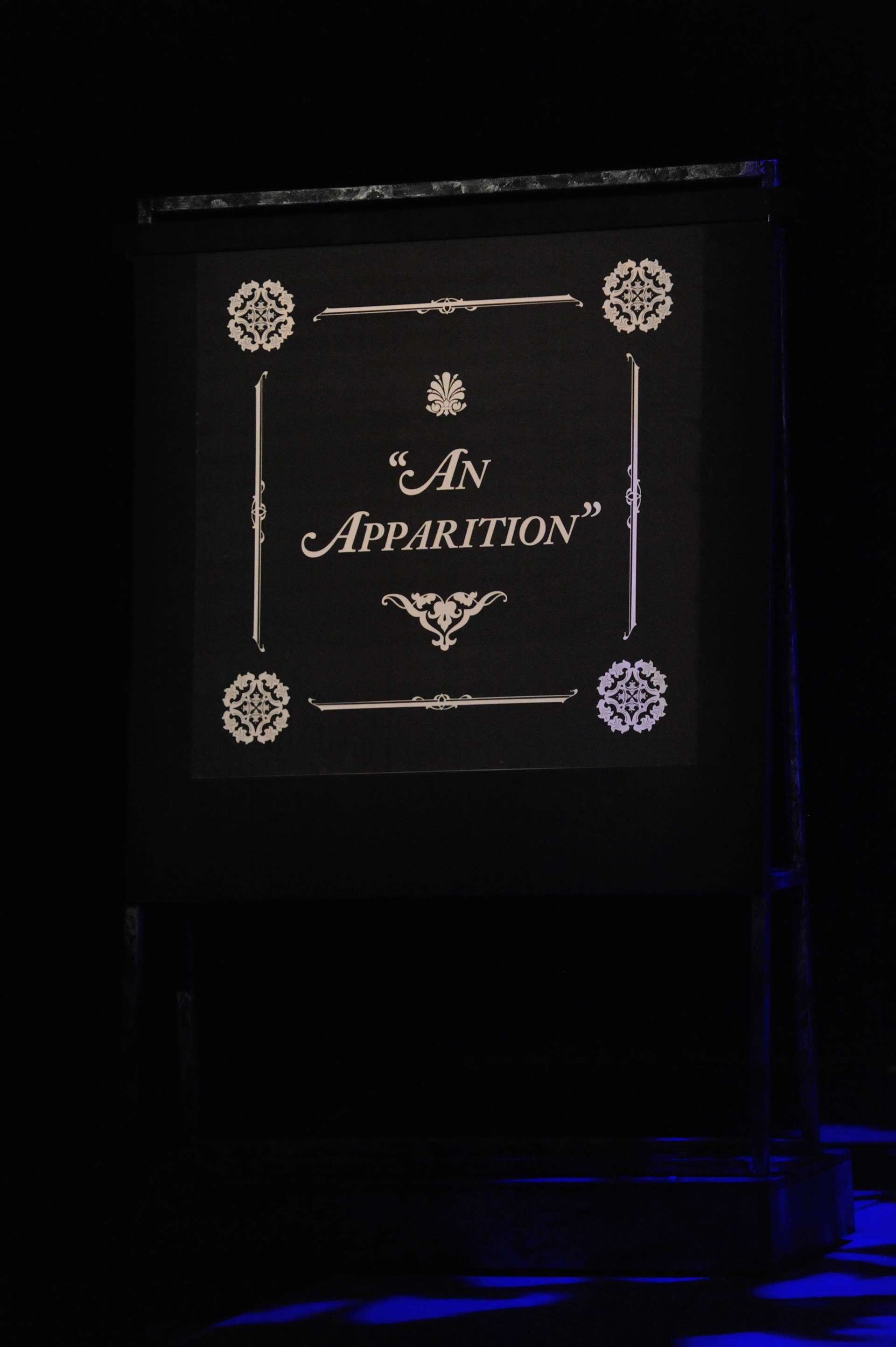
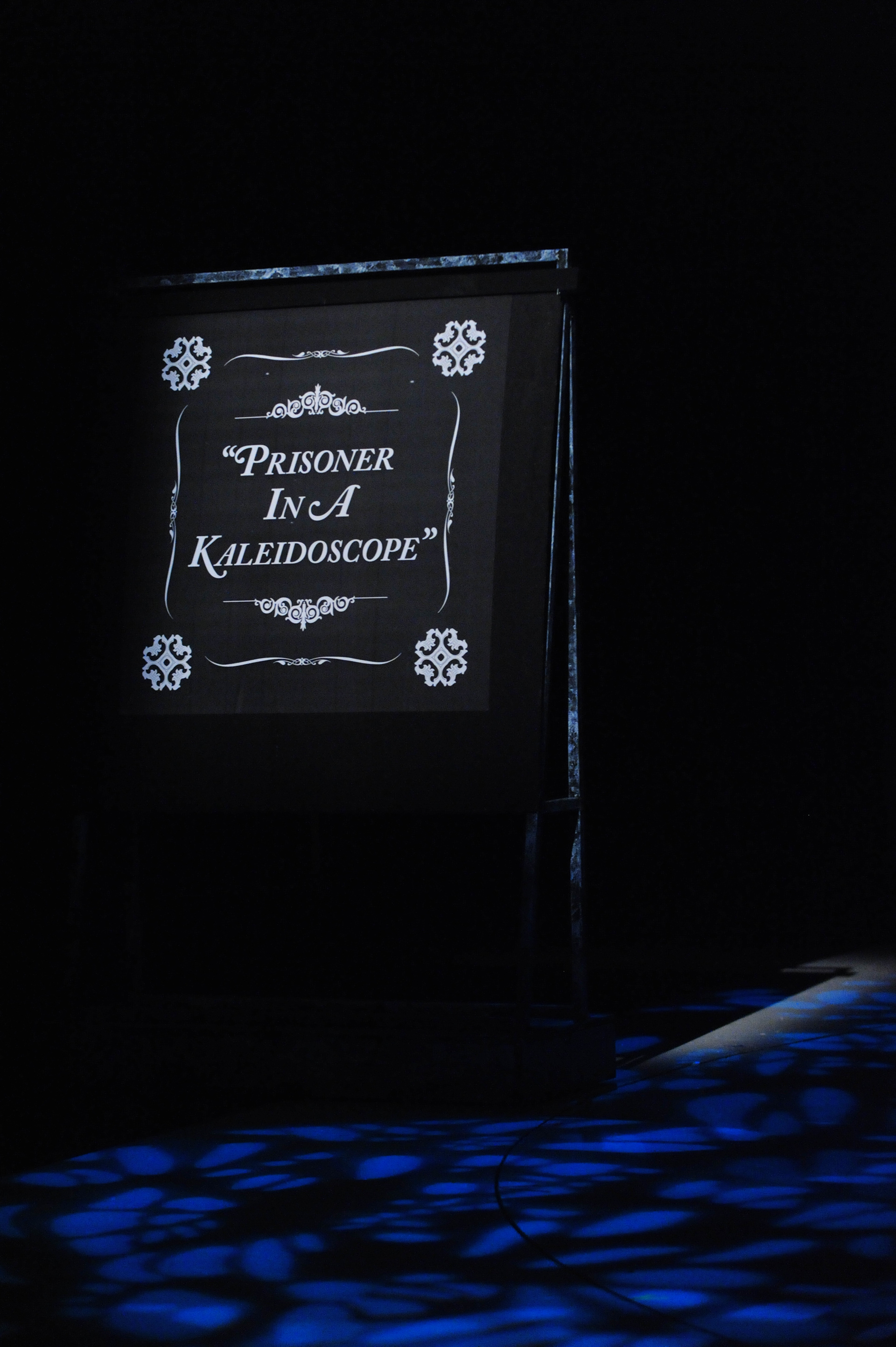
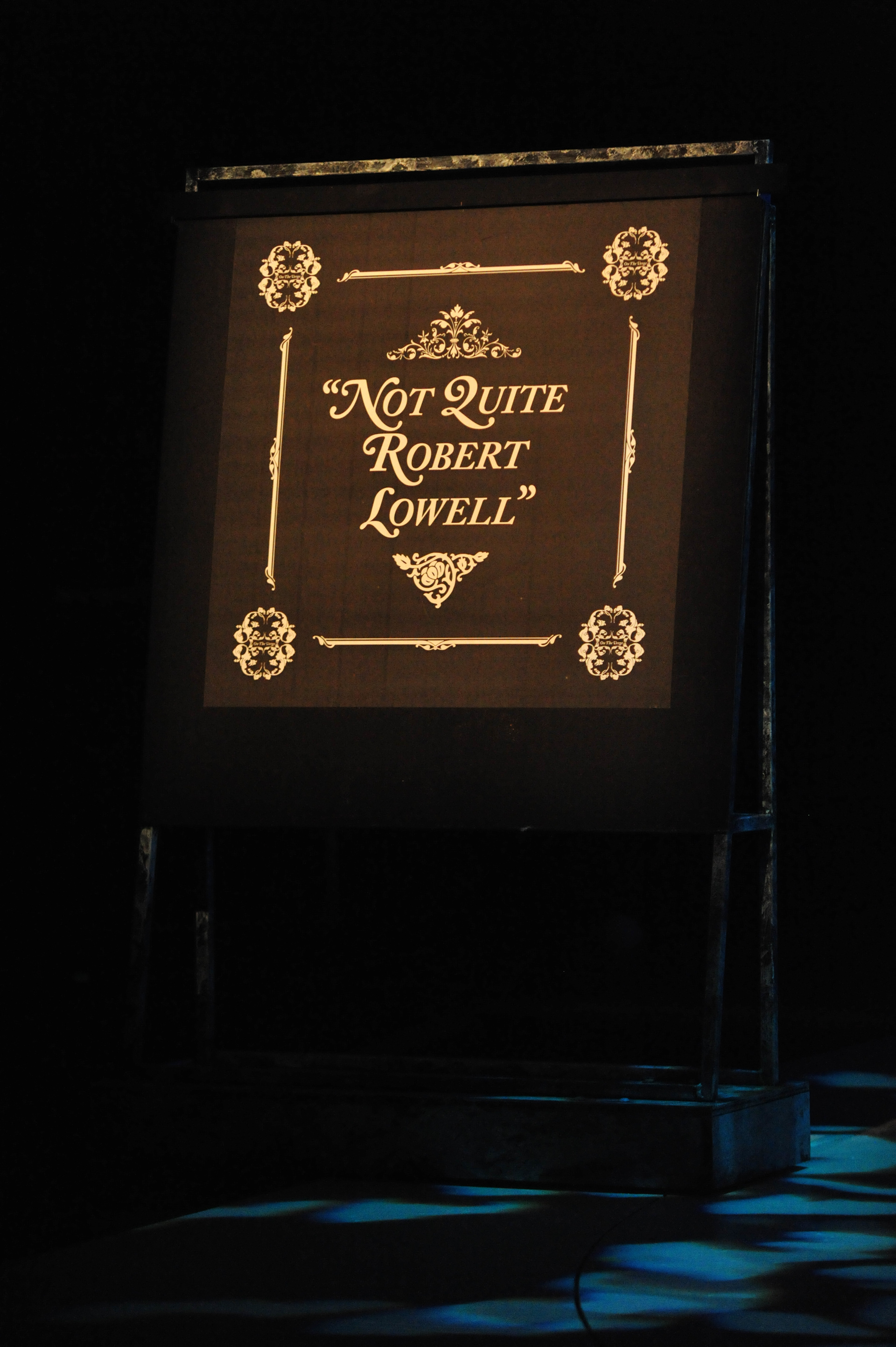
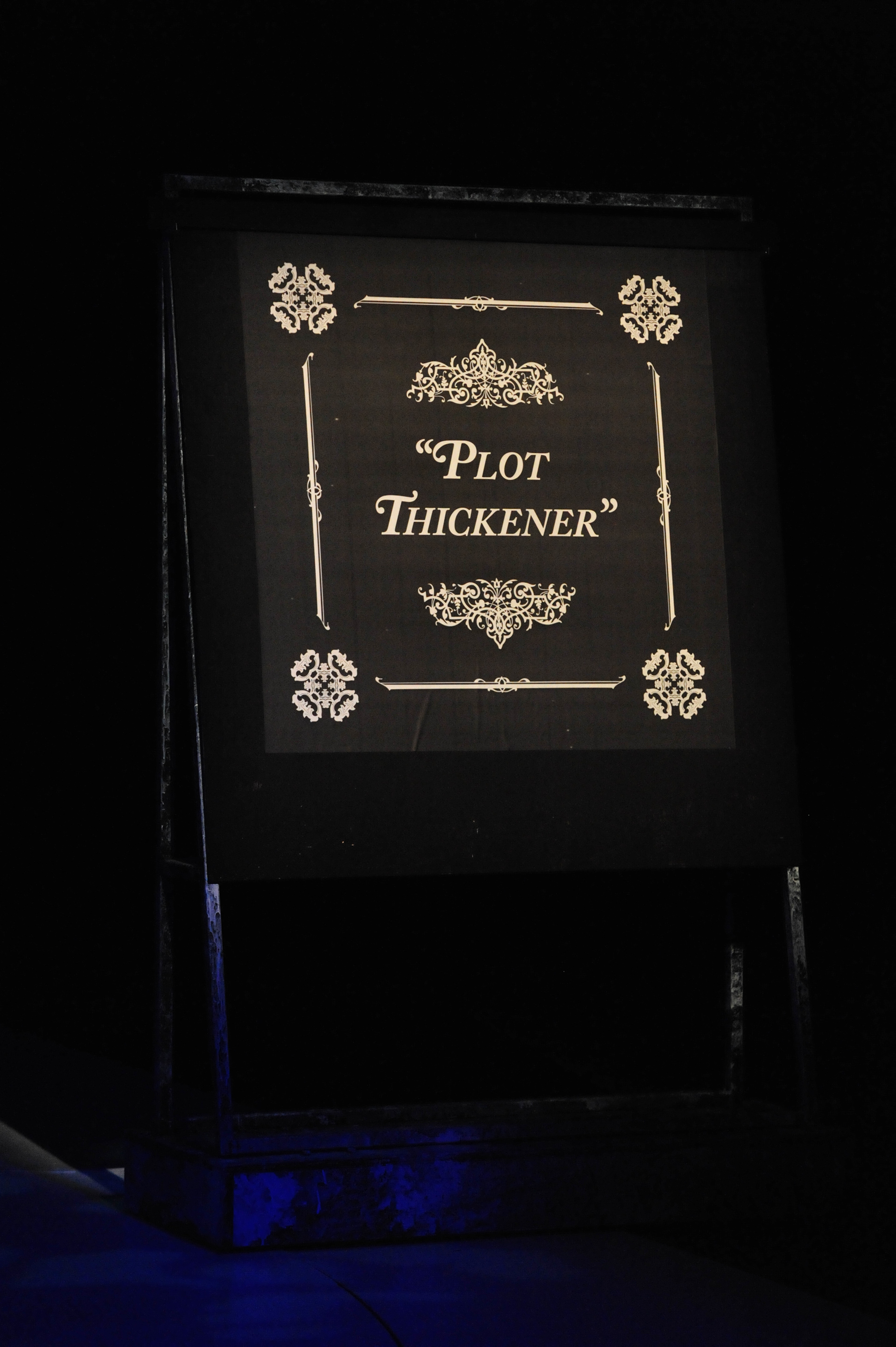
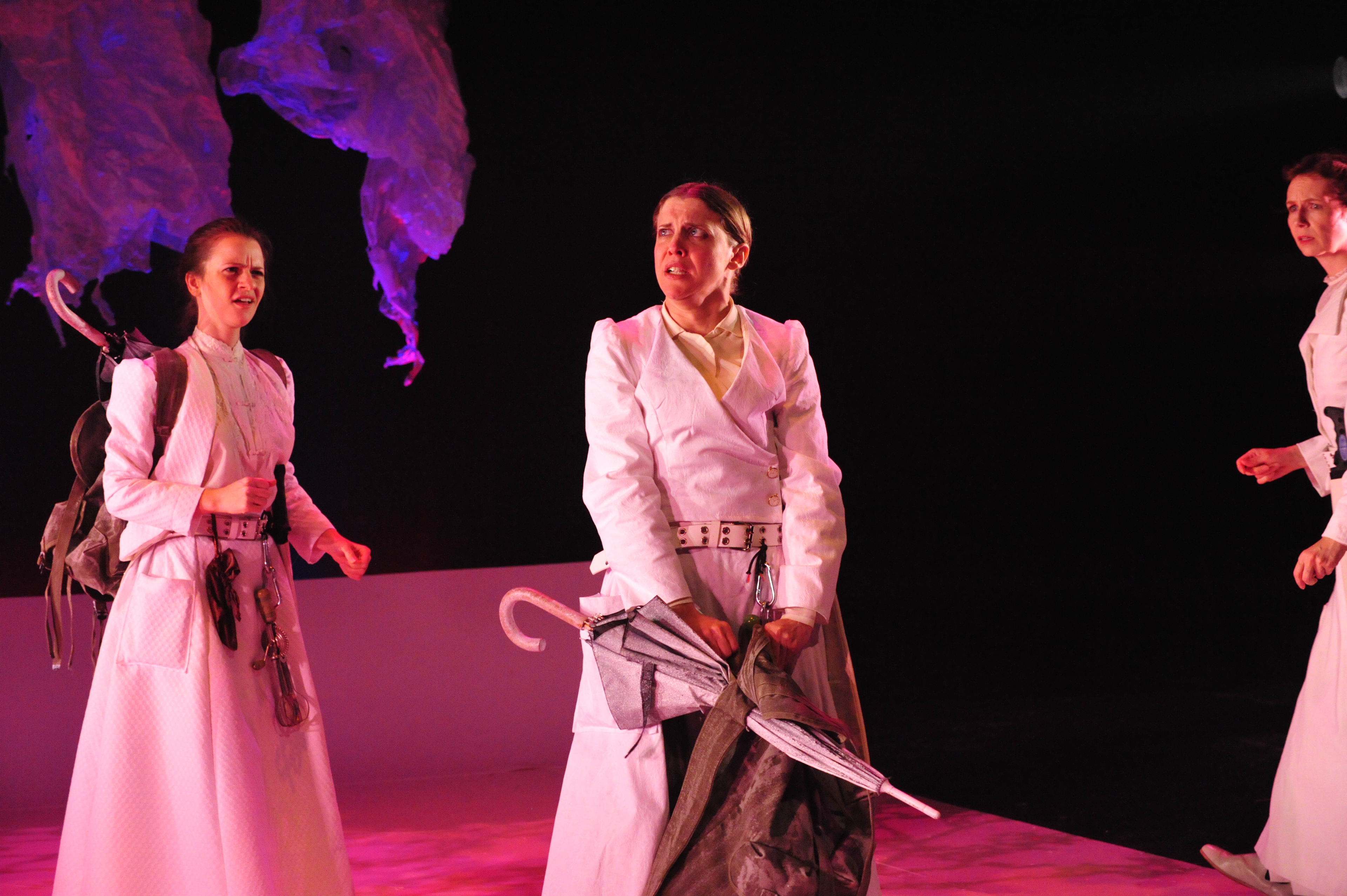
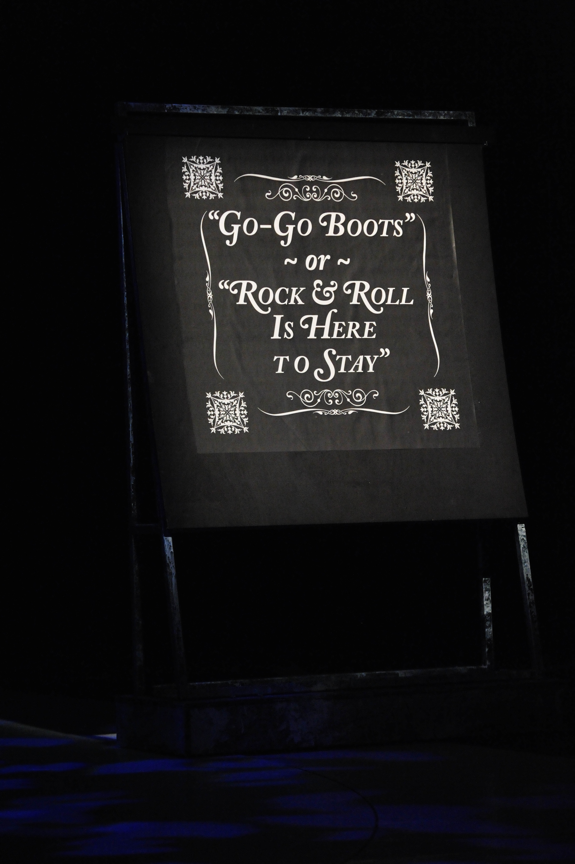
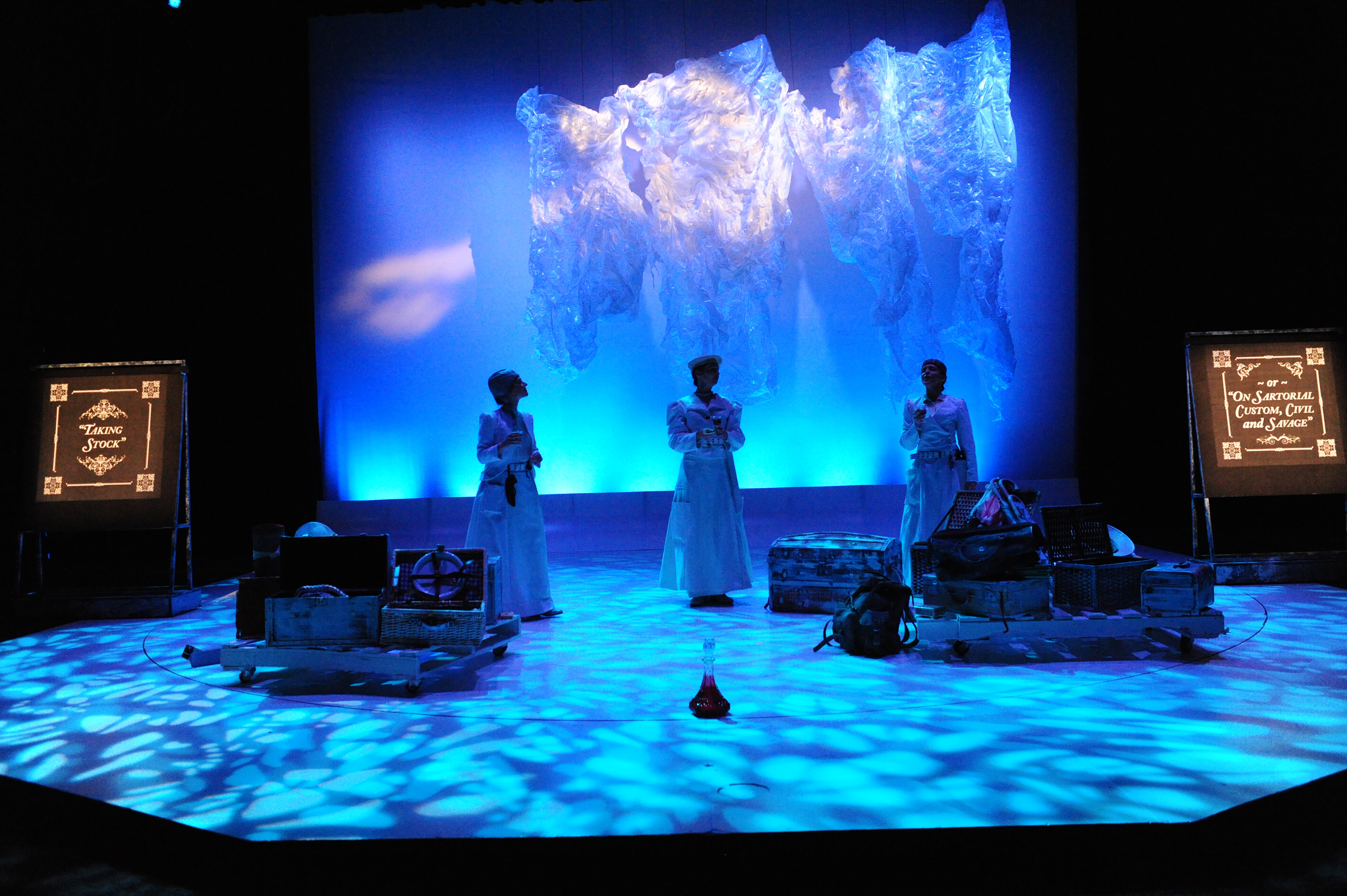
"On the Verge" is a play about three time-traveling Victorian women who critique contemporary society. For this project I worked with the production's creative director to produce twenty one 45" x 45" title cards that would accompany each scene of the play. I started producing three starkly different concepts to establish an art direction for work.


After discussing the merits of each we decided to combine the typography of the first sample (set in Adobe Caslon Pro) with the ornamentation of the of the third sample. Our reasoning that when taking into account the variable distance of the audience and lighting that was designed more for mood and setting than readability, much of the fine scroll work in the first two samples would be lost on the audience members in the furthest rows. From there I worked quickly to produce the other 20 title cards for first round submission and then work with the creative director to make and tweaks or adjustments.